Hello everyone,
I just wanted to let you know you will see a change to the site look tomorrow.
In our surveys, you’ve given us feedback that it can be hard to know where to begin when joining the site. You’ve also told us that the community would benefit from a Help topic (which we have here, but which hasn’t been easy to find).
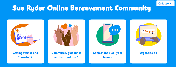
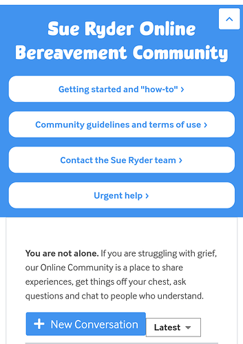
To support you in using the community, we’re introducing a new header that has quick links to important pages, like our Help page, our Community Guidelines, how to contact us and to Urgent Help.
On desktop, it will look like this:
You can dismiss it at any time by clicking, “Collapse”, and expand it at any time by clicking, “expand”.
On mobile, it will look like this:
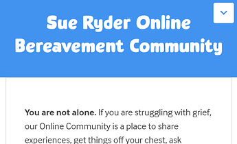
When collapsed:
The site will remember your choices between pages, so you can keep the header expanded if you like, or have it collapsed so you can expand should you wish to look at it.
Other developments
You have also told us that sometimes, reading the posts on the community can be upsetting. We would like to get your opinion on trialing a self-care pop-up. I’ll share more with you soon.
I’m also making some video tutorials for using the community for people who prefer to watch, rather than to read, instructions.
I hope the headers are helpful. They will go live tomorrow at 9am. If you see anything on the site behave strangely afterwards, please drop me a PM and let me know ![]()
Thank you all ![]()
Seaneen


